 Close ×
Brand Identity · Visual System · Application
StableTech
StableTech develops precision cooling infrastructure for data centers and high-performance systems.
I created an identity that makes complex engineering feel clear, dependable, and ready to scale—from the logo and typography to digital products and physical equipment.
01 · Brand Foundation
Precision should feel dependable at first glance.
The identity needed to speak to engineers and decision-makers without feeling cold or generic. Every element is structured to communicate control, efficiency, and long-term reliability.
02 · Logo Exploration
Four ways to make complex systems feel stable.
Each direction began with the letter S, then tested a different balance of stability, connection, data flow, and modular infrastructure.




03 · Selected Identity
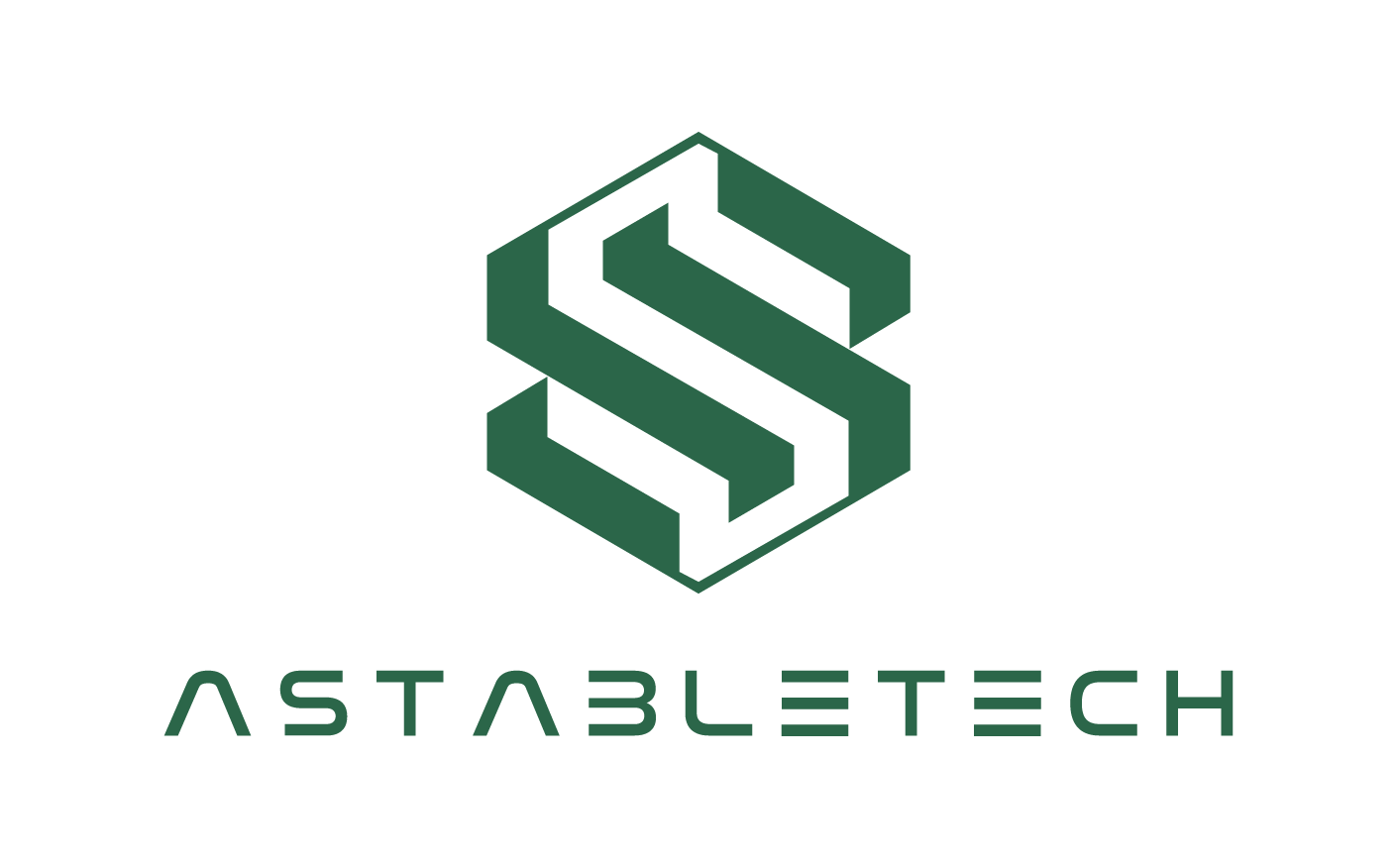
An “S” built like the systems behind it.
The logo combines the letter “S” with visual cues inspired by piping systems and data center hardware. This creates a symbol that reflects cooling flow, technical precision, and the reliable foundation of digital infrastructure.
04 · Typography
A technical voice that stays easy to read.
IBM Plex Sans gives headlines an engineered character, while Inter keeps supporting copy and interfaces calm and practical. Together, they make technical information feel confident, structured, and easy to navigate.
Aa Bb Cc Dd Ee Ff
Precision cooling,
built to perform.
Aa Bb Cc Dd Ee Ff
Reliable infrastructure
for critical systems.
05 · Color System
Green signals performance, not decoration.
Deep green grounds the system in stability and trust. A brighter green brings energy and progress, while white, black, and warm neutral keep layouts composed. Orange appears only where attention or action matters.

06 · Brand Applications
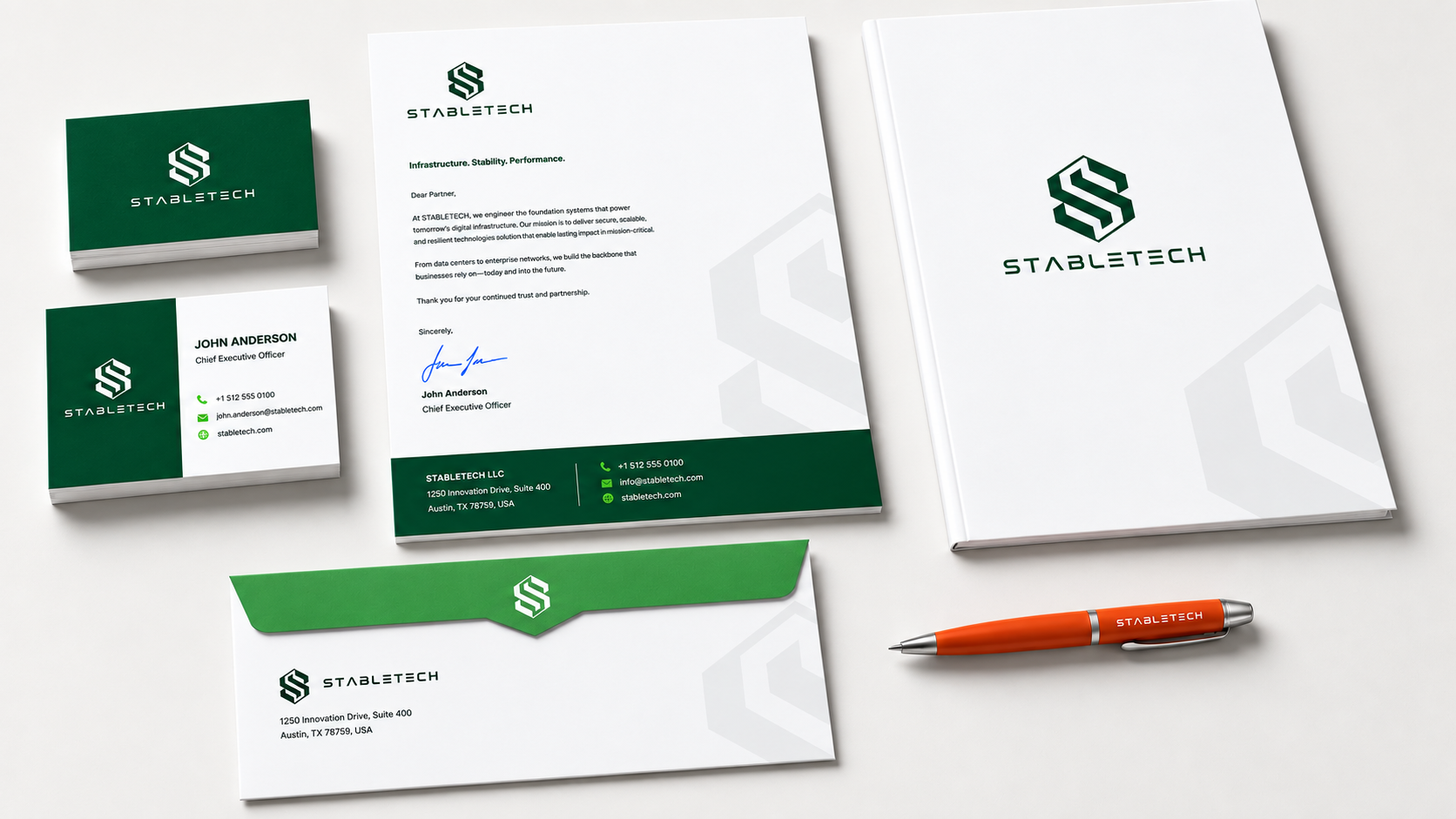
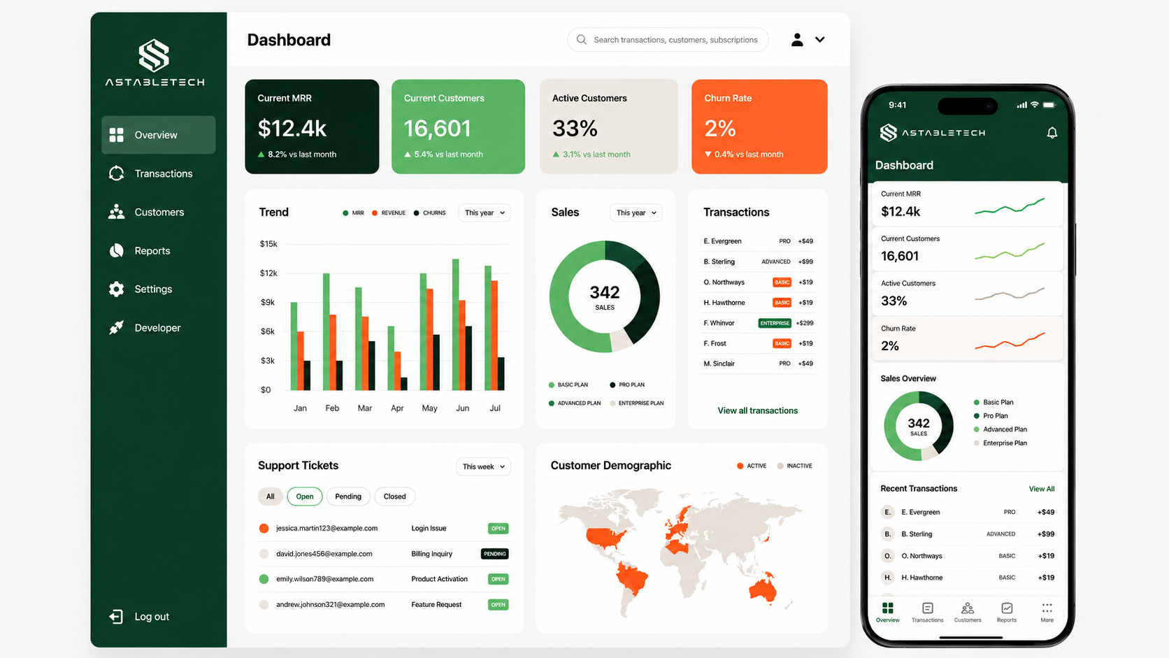
One system, from documents to dashboards.
The identity carries across business materials and product interfaces with the same balance of technical structure and open space. Repeated proportions and restrained color make every touchpoint feel connected.
07 · Built for the Real World
Clear at every scale.
The mark holds its shape on uniforms, industrial equipment, and large architectural signage—giving the brand a consistent presence wherever the technology operates.
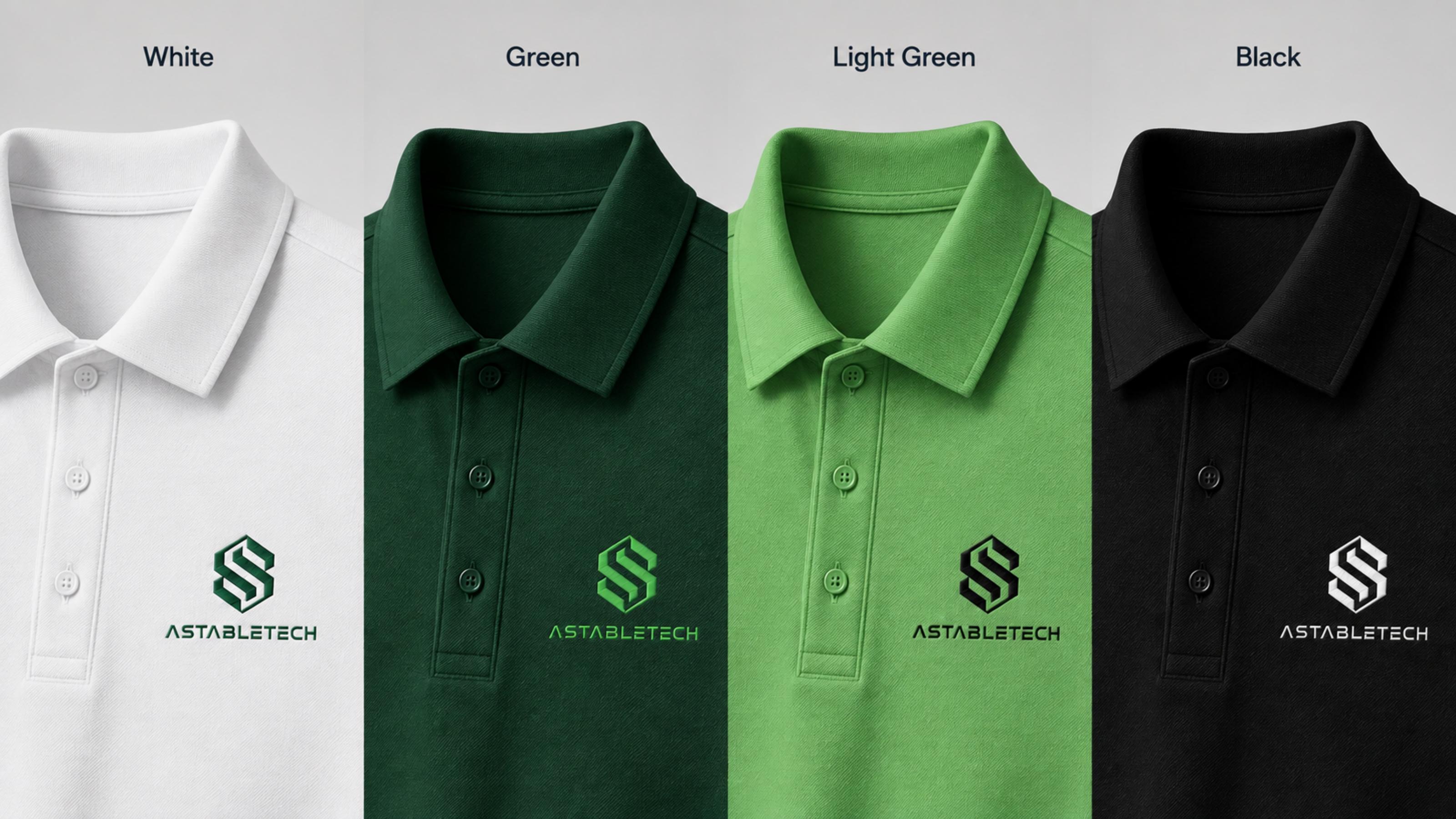


A system designed to scale
Engineering credibility, made visible.
StableTech now has a focused identity that translates technical expertise into a clear, confident brand across digital tools, equipment, and the spaces it inhabits.