 Close ×
Brand Creation · Identity · Packaging · Digital
The Soil Chef
The Soil Chef began as a new idea: make specialized potting soil feel less technical and more personal for people who care deeply about their plants.
I built the brand from the ground up, shaping the positioning, visual identity, packaging, digital experience, and launch content into one distinct and approachable system.
Role
Brand Designer
Scope
- Brand Positioning
- Naming & Messaging
- Visual Identity
- Packaging Design
- Website & Mobile
- Launch Content
01 · Brand Foundation
What if the wrong soil could ruin your plant’s day, week—or even its life?
For millions of passionate plant people, what their plants can grow in shapes the way they garden. The Soil Chef creates Potting Soils From Scratch—custom, handcrafted blends alive with beneficial microorganisms and free from fillers, peat, and synthetics. Each mix is a living ecosystem made to support vibrant growth, healthy roots, and a greener planet. Because when soil is crafted with care, everything grows better.
02 · Logo Exploration
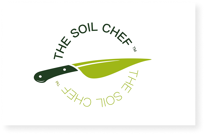
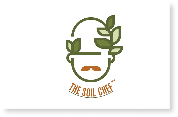
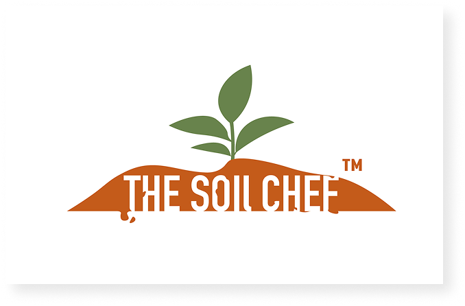
How should a “soil chef” look?
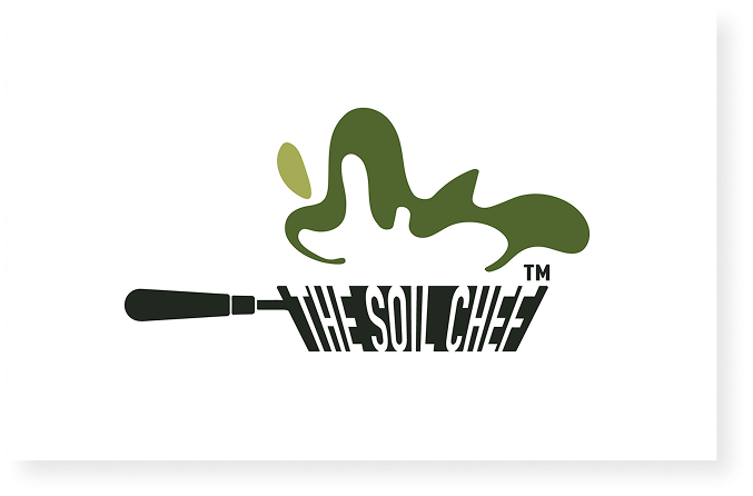
I developed four distinct directions to test how literal, expressive, or character-driven the identity could be. Each route combined gardening and culinary cues differently, helping reveal what the brand should—and should not—feel like.
03 · Selected Identity
A memorable mark built to work anywhere.
The final direction moved away from a literal chef mascot. A custom wordmark integrates a fork into the “O” and turns the final letter into a planted pot—keeping the original idea present while making the identity feel unmistakably rooted in gardening. The modular letterforms give the system more range across packaging, digital, and environmental applications.


Typography System
Bold character, balanced by everyday clarity.
Avant Garde Demi gives the brand a confident, contemporary voice. Futura Medium supports it with clean, practical typography for product details, digital content, and longer-form communication.
Aa Bb Cc Dd Ee Ff
Potting Soils
From Scratch.
Aa Bb Cc Dd Ee Ff
Made for healthier roots
and happier plants.
04 · Color System
Colors rooted in soil and plant life.
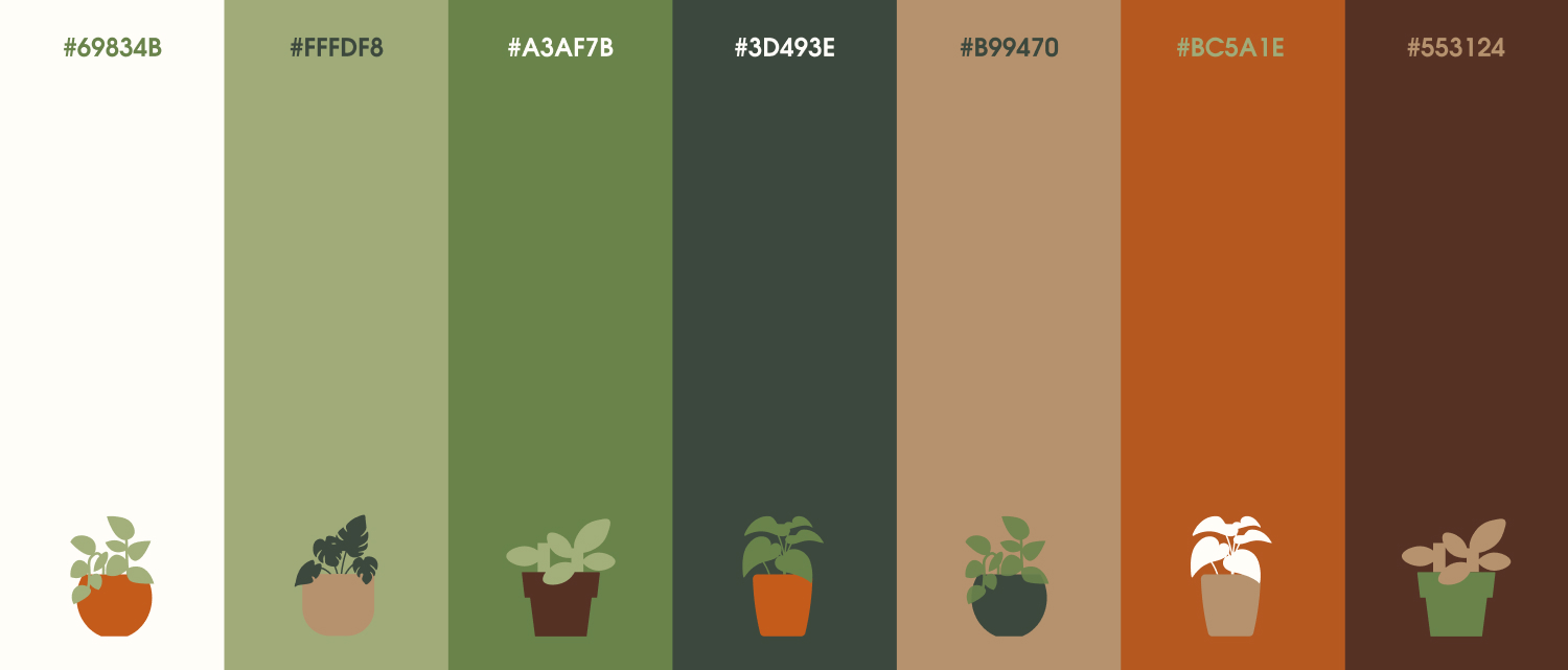
Deep forest green establishes expertise and stability, while sage brings the living, botanical side of the product forward. Rust orange adds energy and recalls terracotta and warm soil. Cream and earthy neutrals keep the system tactile and approachable, giving brighter colors space to work across the range.
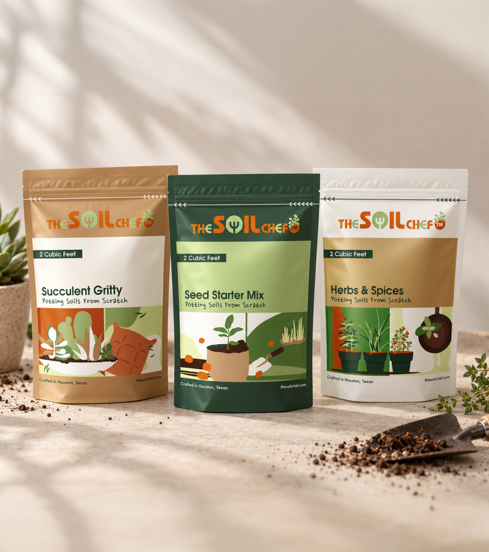
05 · Packaging System
Helping people find the right soil at a glance.
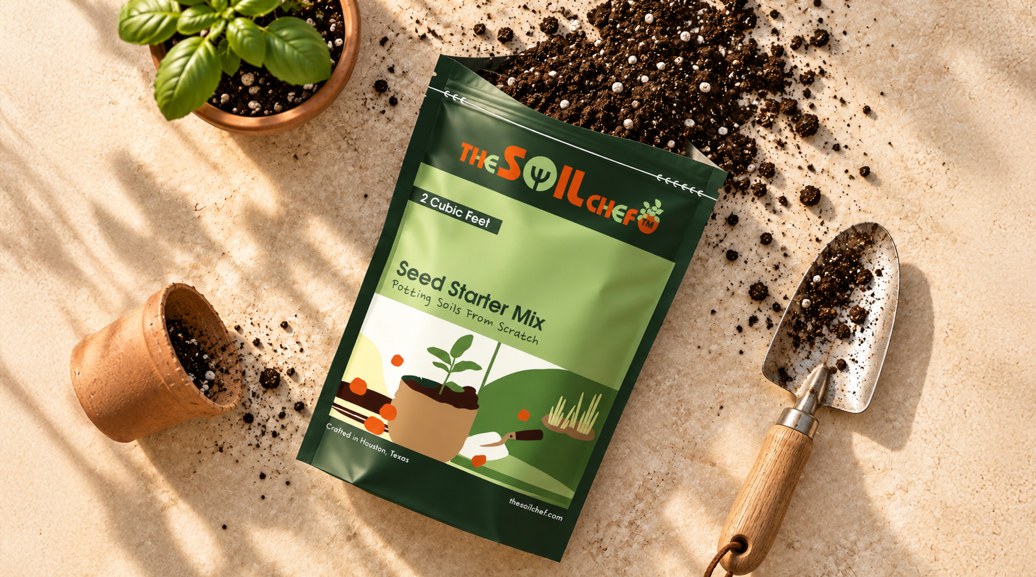
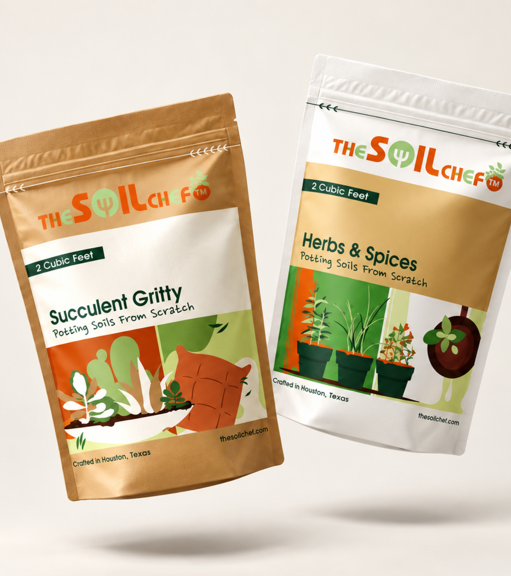
The packaging gives every blend its own visual story while keeping the product family connected through a clear hierarchy, bold illustrations, and consistent functional cues.
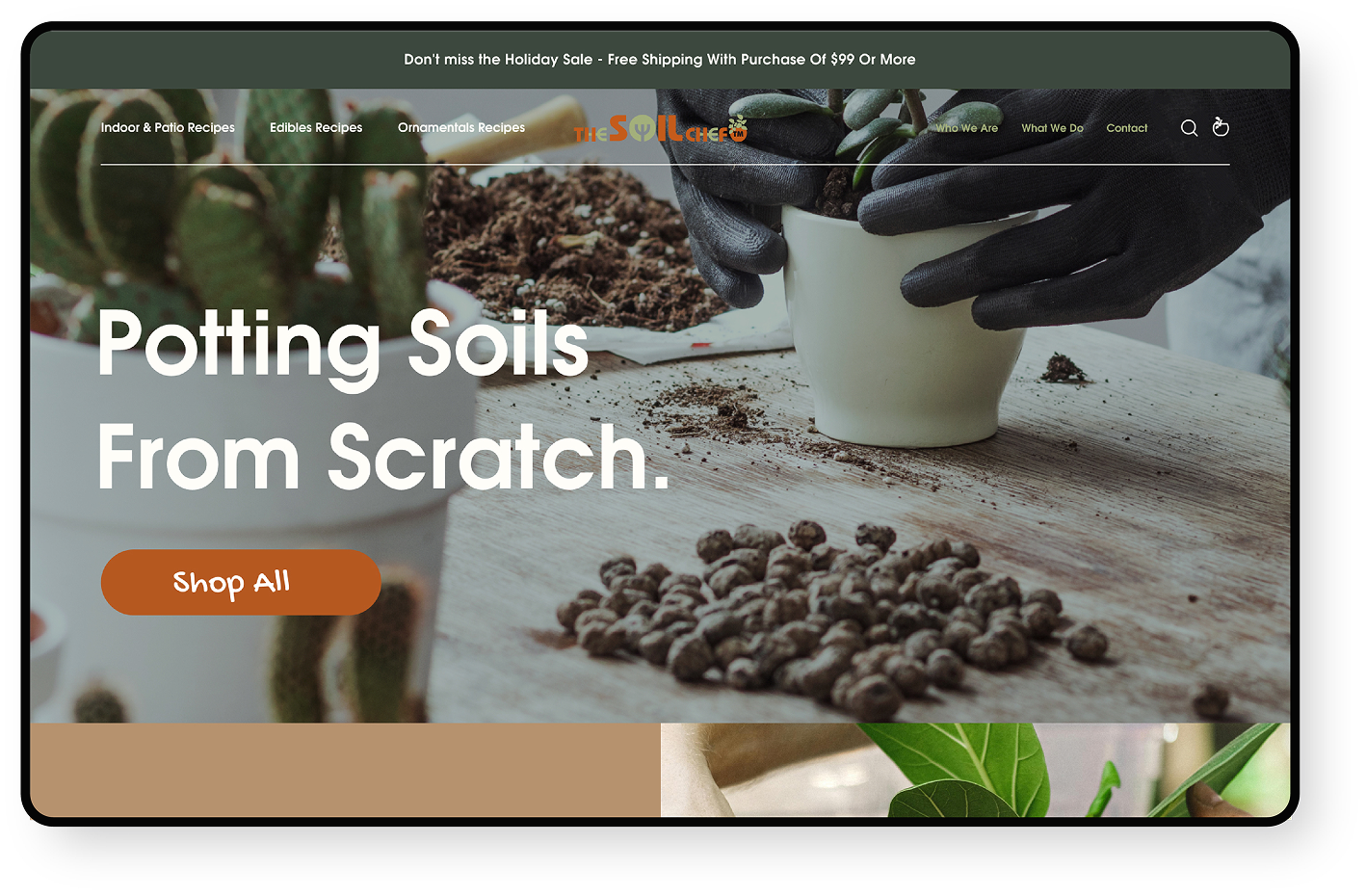
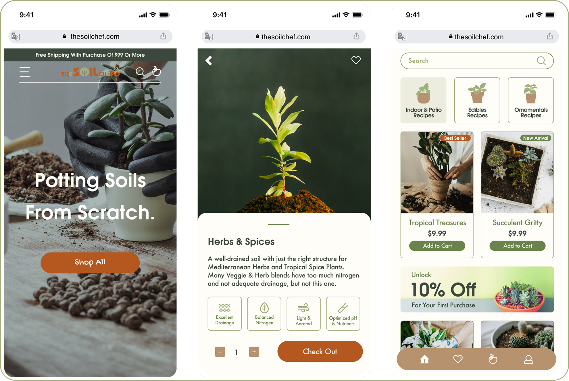
06 · Digital Experience
Making the right soil easier to find online.
I extended the identity into an e-commerce experience organized around plant needs. Clear category paths, useful product details, and tactile imagery help customers find the right mix without losing the brand’s personality.
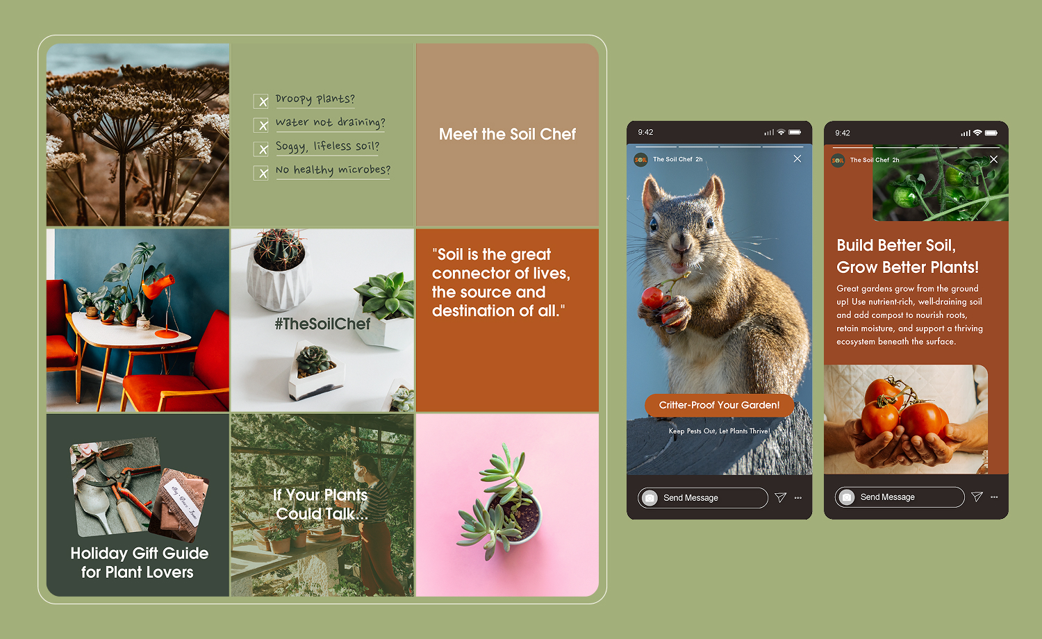
07 · Content & Launch
A launch voice that feels useful, warm, and distinct.
The launch system mixes useful plant knowledge, product storytelling, and a slightly unexpected personality. A consistent grid, palette, and tone let the content move between education and promotion while staying unmistakably Soil Chef.
08 · Brand Applications
Carrying the brand beyond the bag.
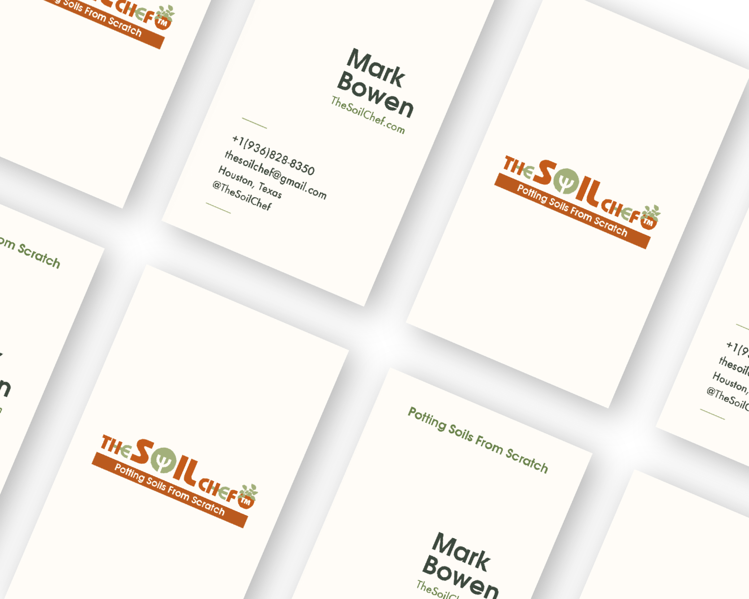
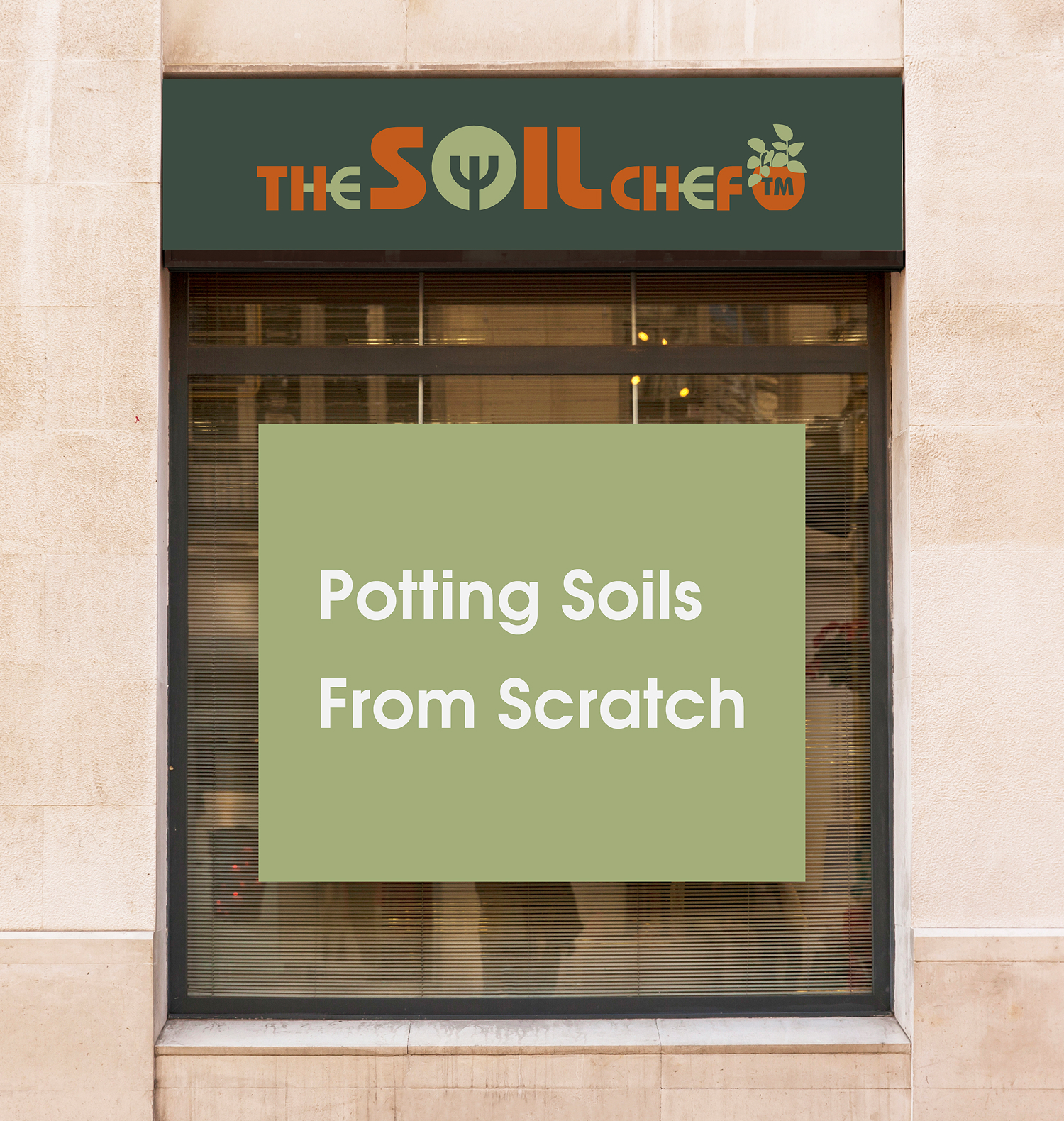
The identity was designed to work at every scale—from the tactile restraint of a business card to the immediate recognition required for storefront and environmental graphics.
From concept to brand system
A brand built from the ground up.
The result is a practical brand system with a clear point of view—ready to work across packaging, commerce, content, and physical space.